RESEARCH TOPIC: “How typography, particularly in relation to typefaces, has developed since the introduction of the first printing press by Gutenberg in the mid 15th century BCE”.
INTRODUCTION
The purpose of my research project was to examine the development of typefaces from mid 15th century to current times. The invention of movable metal type brought about the first typeface, ‘Blackletter’. Typeface design then continued through to the present day. My project traces the most important events and typeface innovations from the beginning in the mid 15th century to the typefaces of those of this decade, the commencement of the 21st century.
IN THE BEGINNING
Johannes Gutenberg started a printing business in Mainz using his inventions - movable metal type and a typecasting machine [Garland & Garland 1997]. His metal type produced a clearer image than wood and the letters could be reassembled and reused. Books could be printed more quickly and at less cost. The first full-length book Gutenberg printed was the 42-line Bible, completed in 1455-56. The letters were carefully copied from the letters originally drawn by the scribes. This typeface was called ‘Blackletter’ or ‘Gothic’ [Bastoky Design 2010].
FROM ROMAN TO GARAMOND
Printing presses had spread throughout Europe by the late 15th century. Transitional typefaces were developed in Venice under humanist influences [Bamber 2001]. Inscriptional typefaces on Roman buildings inspired the introduction of contrasting thick and thin strokes, serifs and lower-case letters. In Italy the Frenchman, Nicolas Jenson, designed open, elegant typefaces that influenced later design development. The first slanted Italic style resulted from popular demand. Francesco Griffo’s ‘Aldino’ Italic typeface teamed uneven ascenders and descenders with small unslanted capitals. The slanted letters took up less room thereby making printed books smaller and cheaper. The popularity of Italics faded in the mid 16th century. French style followed the Italians but was very arty and didn’t really progress further for 150 years. Claude Garamond produced a very legible Roman serif typeface that was very influential. His lower-case letters were based on the handwriting of King Francis 1’s librarian. Most modern Italics are based on the work of Garamond’s assistant, Granjon [Wikipedia 2010]. Garamond was the first independent type founder and sold his type to printers. The Bishop of Oxford, Dr John Fell, gathered European print types and created typefaces called the Fell Types. Their characteristics quickly became obsolete once Caslon’s typefaces were introduced. Typeface design and printing innovation slowed in the 17th century. Work from Garamond and others spread beyond France. Leydon and Amsterdam became important publishing centres. Christoffel Van Dyck refined Garamond’s designs.
18TH CENTURY DESIGNS
William Caslon 1 designed ‘English Arabic’, Roman, Italic and Hebrew typefaces. His Roman design (1726) became known as ‘Caslon’. He formed his own type foundry and was joined by his son. They published the first English book of typefaces. Their ‘English Roman’ and ‘Caslon’ typefaces had slightly bracketed serifs and slight, old-style irregularities. John Baskerville followed Caslon. His work shows the beginning of the transition from old-style to modern design. He was obsessed with creating a simple, elegant and clear typeface family. Baskerville introduced printing modifications that resulted in very clear, crisp impressions and high standards [Woodward 2010]. The influence of Baroque and Rococo design aesthetics brought about contrast between thick and thin strokes, sharp and delicate serifs and precise details. Frenchman, Fournier Le Jeune, used curved and complex decorations. His Italics were influenced by copperplate engraving. In 1737 he devised an important standard ‘point’ system [Linotype GmbH 2010] which allowed typefaces with certain variations and similarities to be used together. The final printed dimensions could now be calculated and the printing planned for a good-looking result. Fournier published a 2-volume manual that incorporated the history of typography in Europe and many decorative fonts and ornaments. Giambattista Bodoni continued the transition to the new classical style in the late 18th century by reintroducing a heavy, graceful style. Along with the French Didot family he stressed the difference between the heavy line and the hairline type characters. Like Baskerville, Bodoni sought ‘purity of form’ to increase clarity and readability. The Didot family also aimed for design purity [Encyclopaedia Britannica Online Library Edition 2010]. They improved the point system and it became universally accepted.
19TH CENTURY DESIGNS
Slab-serif typefaces became popular at this time and were known as the Egyptian style. Englishman Vincent Figgins created a slab-serif type (1815-17) called ‘Antique’. American type founders used the same term. Slab-serif come in 3 styles: the Clarendon model (with a little bracketing); the Neo-grotesque model (no bracketing and evenly-weighted stems and serifs); and the Italienne model (serifs are heavier than the stems). Newspaper typefaces, e.g. Courier, also have slab-serifs to prevent damage to the type stems during printing. During the second wave of the Industrial Revolution machinery took over artisanal occupations such as typography and printing. Once Linotype and Monotype machines were introduced in 1886 and 1887 large type manufacturers became established. Successful typeface designs were now trademarked and used to ‘brand’ products. The Art Nouveau movement, popular at the end of the century, was characterised by stylized organic motifs. The Arts and Crafts movement, most influential between 1880 and 1910, reacted against the way the Industrial Revolution had replaced crafts and craftspeople with machine-made goods of poor quality and design. William Morris set up the Kelmscott Press to revive typography and the traditional book arts. He designed typefaces and hand-made books. Although the Kelmscott Press only lasted for 6 years it heavily influenced the private press movement [Mirror of the World 2010].
HINT: The Mirror of the World
 | |
| The Ideal Book: William Morris and the Kelmscott Press Exhibition in Buffalo, NY | . |
EARLY 20TH CENTURY DESIGNS
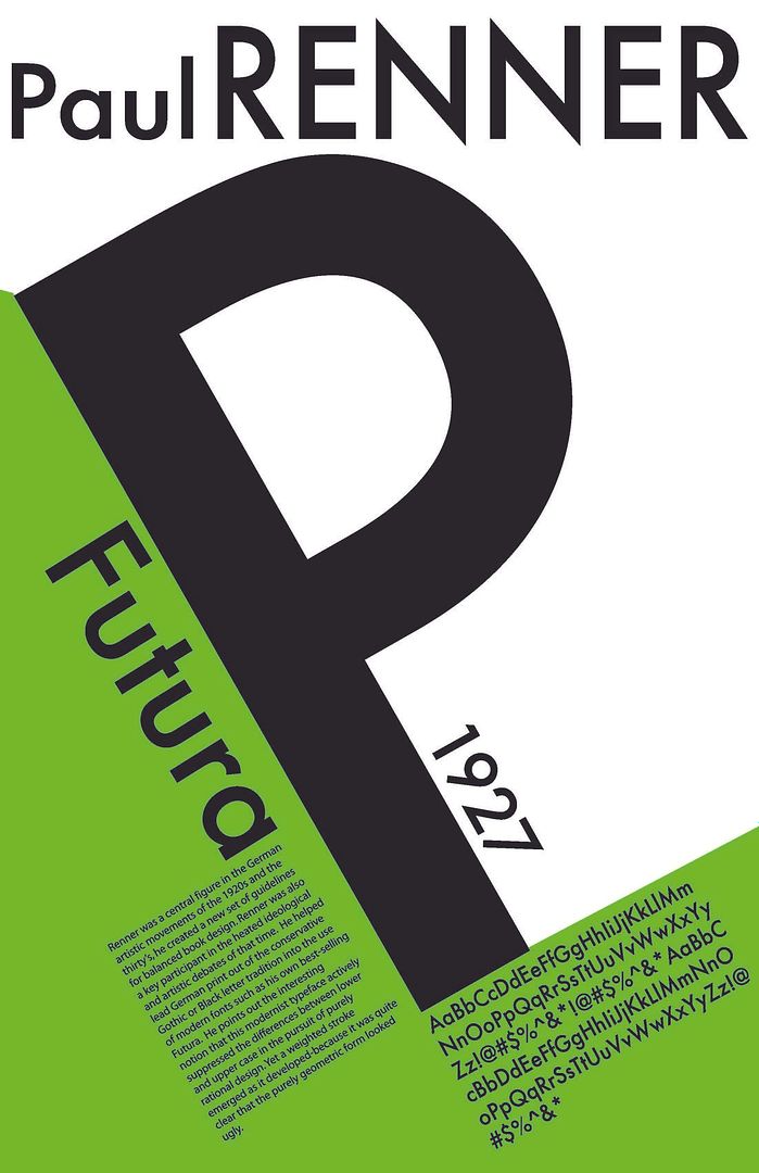
Edward Johnston examined the British Museum’s manuscripts and published a book on writing, illuminating and lettering in 1906 which became influential in Germany. There, ‘Blackletter’ typefaces were still in use. In 1916 Johnston designed a sans-serif typeface, ‘Johnston’, for the London Underground [Wikipedia 2010]. The New Book Art movement, operating prior to WW1 in Germany, used a more straightforward approach than the decorative Art Nouveau styles. William Morriss’s influence reached Frederick W. Goudy in America who created more than 100 typefaces during his working life. His successful types include ‘Copperplate Gothic’, ‘Goudy Old Style’ and ‘Trajan’ [Boardley 2009]. Art Deco style brought a plainer, more rectilinear design early in the century. English typographer, Eric Gill, designed ‘Gill Sans’ in 1927 [Stuart-Smith 2010]. Jan Tschichold published 2 radical books in the 1920s claiming book layouts should be asymmetrical and typefaces should non-decorative sans-serif designs [McLean 2010]. Sans-serif typefaces were being introduced at that time, including ‘Futura’ by Paul Renner in 1927. Meanwhile in Germany, ‘Blackletter’ was still seen as traditional until 1941 when its use was abolished. Tschichold later relaxed his stance on serifs and produced successful typeface designs such as ‘Sabon’ (1967). Stanley Morison published “First Principles of Typography” in 1930. He was a typographic consultant to Monotype for over 40 years. In the 1930s Morison became involved in the redesign of ‘The Times’ newspaper, which also resulted in the introduction of ‘Times New Roman’ [Grove Art Online 2010].
LATE 20TH CENTURY AND NEW MILLENNIUM DESIGN
The Swiss designer, Adrian Frutiger, designed the successful typefaces ‘Univers’ in the late 1950s and ‘Frutiger’ in 1976. These sans-serif designs were intended to convey warmth and simplicity while being highly legible. Both allow for a comfortable amount of whitespace between the letters. Prominent ascenders and descenders and letters with wide apertures help enhance legibility [Linotype 2008]. ‘Frutiger’ is a very popular font available in many variants. It is used widely throughout Europe. Carol Twombly, an American typographer, had great success with her redesign of ‘Caslon’ [Sherin 2001]. ‘Adobe Caslon’ is popular as its heavy serifs and large x-height make it very readable. It was one of the first to be designed specifically for Desk Top Publishing. Desk Top Publishing (DTP) became popular in the 1980s with the rise of PCs and the WYSIWYG user interface. The layout on the screen and the final output are very similar and the content could be easily edited. Design elements, such as font choices, were accurately represented and are inserted via style sheets. DTP allows for the publication of electronic and virtual paper pages.
READABILITY & CHOOSING THE RIGHT FONT
Visual communications must effectively capture the audience’s attention. A small default font and crowded will convey a negative message. Choose a serif or sans-serif font based on the size and amount of text. Readability is more important than legibility. Adequate whitespace between lines, words and letters enhances readability, as does a large x-height [vLetter 2010]. Choose a font that suits your message. Sharp letters suit business documents. Create a cohesive image by using the same font for all your correspondence [suite.101.com 2009].
WEB TYPOGRAPHY
Typography aids the design of interesting web pages. High contrast of text to background influences readability. Hierarchy involves varying type size or a mix of typefaces to point to the relative importance of areas of text [Boardly 2007]. Whitespace around text helps create a balanced appearance [Boulton 2007]. Increasing letterspacing for capital letters, acronyms, abbreviations and strings of numbers makes them easier to read. Placing invisible grid lines over a page will assist with the harmonious placement of page elements.
THE FONT WARS
‘Helvetica’ was designed in 1957 as a neutral typeface. It is widely used in commerce and by Governments. It was named No.1 on FontShop Germany’s list of “Best Fonts of all Time”. ‘Arial’ was created in 1982 and has been included in Microsoft’s Windows software since Windows 3.1 (1992). Its letter forms and spacing were intended to make ‘Arial’ very readable at various resolutions. It is one of the most used and widely-distributed typefaces in the world. Whether or not ‘Arial’ is a ‘Helvetica’ clone is still being debated.[Boardly 2007] Read about Helvetica v's Arial and try out the "Fontometer" on the ilovetypograpy blog! ‘Comic Sans’ has been misused and overused. It is also subject to a campaign against its use by a couple of typographers, Dave and Holly Combs, and is frequently the subject of passive-aggressive notes. When IKEA changed its signature font from a custom version of Futura to ‘Verdana’ in 2009 complaints came from all over the world.
CONCLUSION
The invention of movable metal type and the first typeface, ‘Blackletter’, started the printing and typeface design processes. These developments were of immense importance to the development of human society by bringing reading and access to reading materials from the sole province of the rich elite class eventually through to people of all societal levels. The limitations of machinery meant that printing and type founding remained artisanal activities until the advent of the Industrial Revolution brought about the change from craft to mechanical process. The skill and creativity involved in developing typefaces shifted from individuals to corporations. Obviously, creative processes were still a part of designing new typefaces, but the relative importance of the individual designer was diminished. Trademarking and branding overwhelmed the prominent status of designers. Typeface development , however, continued and the pace escalated as did the tempo elsewhere in business. The introduction and increasing importance of the Internet has seen another major change to typeface design. Big corporations still play a huge part but the last few years have seen the rebirth of typeface development by creative people, professionals and skilled amateurs, who are working apart from big business. For the most part their tools have changed from metal and mechanical methods to graphic design and computer programs. For the near future I think the imaginative work of craftspeople will continue to flourish and expand the choices of typefaces from the restricted range available from the likes of Microsoft and Adobe. Further research aimed solely at the establishment and growth of the collaborative and inventive groups and individuals outside of the corporations would also point to the likely future of this movement. This research falls outside the scope of this current project but I believe it would be an area worthy of further study.
BIBLIOGRAPHY:
1. Garland, H & Garland, M 1997, The Oxford Companion to German Literature, Oxford University Press, State Library of Victoria, Viewed 1 September 2010, http://www.oxfordartonline.com.ezproxy.slv.vic.gov.au/subscriber/article/grove/art/T035756?q=Gutenberg&search=quick&pos=1&_start=1#firsthit
2. Bamber, G 2001, History of Printing, HistoryWorld, viewed 13 August 2010, http://www.historyworld.net/wrldhis/PlainTextHistories.asp?groupid=1951&HistoryID=ab78>rack=pthc
3. Garamond 2010, Wikipedia, viewed 14 September 2010, http://en.wikipedia.org/wiki/Garamond
4. Woodward, M 2010, Baskerville, the Man, the Typeface and a Strange, Sad Story 2010, suite101.com, viewed 5 September 2010, Http://www.suite101.com/content/baskerville-the-man-the-typeface-and-a-strange-sad-story-a248215#ixzz0yZRFb8Dx
5. Font Designer-Pierre Simon Fournier 2010, Linotype GmbH, viewed 18 September 2010, http://www.linotype.com/711/pierresimonfournier.html
6. Graphic design 2010, Encyclopaedia Britannica Online Library Edition, viewed 19 September 2010, http://www.library.eb.com.au.ezproxy.slv.vic.gov.au/eb/article-242764
7. Private Press 2010, Mirror of the World, State Library of Victoria, viewed 26 September 2010, http://www.mirroroftheworld.com.au/innovation/private_press/index.php
8. McLean, R. 2010, 'Typography', Grove Art Online : Oxford Art Online, viewed 1 September 2010, http://www.oxfordartonline.com.ezproxy.slv.vic.gov.au/subscriber/article/grove/art/T086759?q=Tschichold&search=quick&pos=3&_start=1#firsthit
9. Stuart-Smith, S. 2010, 'Gill Eric', Grove Art Online : Oxford Art Online, viewed 1 September 2010, http://www.oxfordartonline.com.ezproxy.slv.vic.gov.au/subscriber/article/grove/art/T032249?q=Eric+Gill&search=quick&pos=1&_start=1#firsthit
10. Edward Johnston 2010, Wikipedia, viewed 6 October 2010, http://en.wikipedia.org/wiki/Edward_Johnston
11. Boardley, J. 2009, Sex, Lies & Type, ilovetypography(ILT).com, viewed 18 September 2010, http://ilovetypography.com/2009/10/25/sex-lies-type/
12. http://www.oxfordartonline.com.ezproxy.slv.vic.gov.au/subscriber/article/grove/art/T059641?q=Morison%2C+Stanley&search=quick&pos=1&_start=1#firsthit
13. 'Typography', 2010, vLetter, Inc., viewed 29 August 2010, http://www.vletter.com/aboutfonts.htm
LIST OF IMAGES
1. Blog Image, by toinkyz
http://i216.photobucket.com/albums/cc4/toinkyz/for%20blog/blogboard.jpg
2.Typography Image, by Tsunami65
http://i216.photobucket.com/albums/cc4/toinkyz/for%20blog/blogboard.jpg
2.Typography Image, by Tsunami65
http://i37.photobucket.com/albums/e95/Beccatheblastergirl/Portfolio/oliverRebecca_t4.jpg
3. Flying A Image, by helena_303
http://i88.photobucket.com/albums/k197/helena_303/ornamentaltypography.jpg
4.1 Metal X Image, by toms1802
3. Flying A Image, by helena_303
http://i88.photobucket.com/albums/k197/helena_303/ornamentaltypography.jpg
4.1 Metal X Image, by toms1802
http://i582.photobucket.com/albums/ss265/toms1802/typography-27-big.jpg
5. Garamond Image, by ifindu
http://i170.photobucket.com/albums/u243/ifindu/Portfolio/Typography_Garamond.jpg
6. Typography Rose Image, by promised2luv
http://i170.photobucket.com/albums/u243/ifindu/Portfolio/Typography_Garamond.jpg
6. Typography Rose Image, by promised2luv
http://i45.photobucket.com/albums/f79/promised2luv/typographyrose.jpg
7. The Ideal Book: William Morris and the Kelmscott Press Exhibition in Buffalo, NY
http://morrissociety.blogspot.com/2010/08/ideal-book-william-morris-and-kelmscott.html
http://morrissociety.blogspot.com/2010/08/ideal-book-william-morris-and-kelmscott.html
8. Paul Renner/Futura
http://i45.photobucket.com/albums/f51/ryanjvanacker/rennercopy.jpg9. Typography Image, by bryeanahttp://i629.photobucket.com/albums/uu12/bryeana/Typography_by_fabianohikaru.jpg
10. Punctuation, by nidhisingh
http://i190.photobucket.com/albums/z58/nidhisingh/typographybookcover.jpg
10. Punctuation, by nidhisingh
http://i190.photobucket.com/albums/z58/nidhisingh/typographybookcover.jpg
11. B&W Typography Image, Adobe InDesign CS2,
http://i34.photobucket.com/albums/d117/ArtPortfolio88/typography-poster.jpg12. Helvetica & Arial, by cgrif42
http://i370.photobucket.com/albums/oo148/cgrif42/blog/helvetica-arial.jpg
13. experimental typography, by TLY88
http://i178.photobucket.com/albums/w262/TLY88/experimental_typography_2_by_aarima.jpg
14. Bad Font Choices, Stephendann.com
http://stephendann.com/wp-content/uploads/2010/04/badfont.jpg




No comments:
Post a Comment