Pages

Monday, November 29, 2010

RESEARCH ASSIGNMENT


Typography blogs
  • Font Feed, The 
        [http://font feed.com]
        Fonts; typography; lettering; design; news; type tips
  • ILT
        [http://ilovetypography.com/]
        Free fonts; font wall; articles; type books
  • Ministry of Type, The
        [http://ministryoftype.co.uk]
        Fonts; illustration; brands and logos; books and magazines; interior design; 
        calligraphy
  • OpenType, Ralf Herrmann’s Typography Weblog
        [http://opentype.info/blog]
        Web fonts; fonts; typography; wayfinding
  • Phinney on Fonts, the Phinney-us blog on Typography and text
        [http://www.thomasphinney.com/]
        Font tools; type design; software; hardware; publishing
  • Type Foundry
        [http://typefoundry.blogspot.com]
        Documents for the History of Type & Letterforms
  • Type Directors Club, The
        [http://tdc.org/tdc/]
        Typography Annual; articles and videos; awards; competitions; education
  • Typblography, the Adobe Type Team blog
        [http://blogs.adobe.com/typblography/]
        Fonts; tools; awards; conferences; Indesign
  • Typelog, The
        [http://blog.theleagueofmoveabletype.com/archive
        a collection of typographic projects
  • TypeOff
        [http://www.typeoff.de/]
        Typefaces; interviews; event reports
  • Typesites
        [http://typesites.com/]
        Shop; blog; a weekly look at sites that have great typographic design
  • Typophile – Typographic Collaboration
        [http://www.typophile.com/]
        Typo wiki; forums; projects; news; resources


 "I would like to be remembered as someone who was always full of surprises."
Marian Bantjes

1. Typography (curling pencil), by meridianh
http://i93.photobucket.com/albums/l77/meridianh/typography.jpg
2. Marian Bantjes: Intricate beauty by design
http://www.ted.com/talks/marian_bantjes_intricate_beauty_by_design.html

Final Post


RESEARCH TOPIC:  “How typography, particularly in relation to typefaces, has developed since the introduction of the first printing press by Gutenberg in the mid 15th century BCE”.

INTRODUCTION
The purpose of my research project was to examine the development of typefaces from mid 15th century to current times. The invention of movable metal type brought about the first typeface, ‘Blackletter’. Typeface design then continued through to the present day. My project traces the most important events and typeface innovations from the beginning in the mid 15th century to the typefaces of those of this decade, the commencement of the 21st century.


IN THE BEGINNING
Johannes Gutenberg started a printing business in Mainz using his inventions - movable metal type and a typecasting machine [Garland & Garland 1997]. His metal type produced a clearer image than wood and the letters could be reassembled and reused. Books could be printed more quickly and at less cost. The first full-length book Gutenberg printed was the 42-line Bible, completed in 1455-56. The letters were carefully copied from the letters originally drawn by the scribes. This typeface was called ‘Blackletter’ or ‘Gothic’ [Bastoky Design 2010].


FROM ROMAN TO GARAMOND
Printing presses had spread throughout Europe by the late 15th century. Transitional typefaces were developed in Venice under humanist influences [Bamber 2001]. Inscriptional typefaces on Roman buildings inspired the introduction of contrasting thick and thin strokes, serifs and lower-case letters. In Italy the Frenchman, Nicolas Jenson, designed open, elegant typefaces that influenced later design development. The first slanted Italic style resulted from popular demand. Francesco Griffo’s ‘Aldino’ Italic typeface teamed uneven ascenders and descenders with small unslanted capitals. The slanted letters took up less room thereby making printed books smaller and cheaper. The popularity of Italics faded in the mid 16th century. French style followed the Italians but was very arty and didn’t really progress further for 150 years. Claude Garamond produced a very legible Roman serif typeface that was very influential. His lower-case letters were based on the handwriting of King Francis 1’s librarian. Most modern Italics are based on the work of Garamond’s assistant, Granjon [Wikipedia 2010]. Garamond was the first independent type founder and sold his type to printers. The Bishop of Oxford, Dr John Fell, gathered European print types and created typefaces called the Fell Types. Their characteristics quickly became obsolete once Caslon’s typefaces were introduced. Typeface design and printing innovation slowed in the 17th century. Work from Garamond and others spread beyond France. Leydon and Amsterdam became important publishing centres. Christoffel Van Dyck refined Garamond’s designs.


18TH CENTURY DESIGNS
William Caslon 1 designed ‘English Arabic’, Roman, Italic and Hebrew typefaces. His Roman design (1726) became known as ‘Caslon’. He formed his own type foundry and was joined by his son. They published the first English book of typefaces. Their ‘English Roman’ and ‘Caslon’ typefaces had slightly bracketed serifs and slight, old-style irregularities. John Baskerville followed Caslon. His work shows the beginning of the transition from old-style to modern design. He was obsessed with creating a simple, elegant and clear typeface family. Baskerville introduced printing modifications that resulted in very clear, crisp impressions and high standards [Woodward 2010]. The influence of Baroque and Rococo design aesthetics brought about contrast between thick and thin strokes, sharp and delicate serifs and precise details. Frenchman, Fournier Le Jeune, used curved and complex decorations. His Italics were influenced by copperplate engraving. In 1737 he devised an important standard ‘point’ system [Linotype GmbH 2010] which allowed typefaces with certain variations and similarities to be used together. The final printed dimensions could now be calculated and the printing planned for a good-looking result. Fournier published a 2-volume manual that incorporated the history of typography in Europe and many decorative fonts and ornaments. Giambattista Bodoni continued the transition to the new classical style in the late 18th century by reintroducing a heavy, graceful style. Along with the French Didot family he stressed the difference between the heavy line and the hairline type characters. Like Baskerville, Bodoni sought ‘purity of form’ to increase clarity and readability. The Didot family also aimed for design purity [Encyclopaedia Britannica Online Library Edition 2010]. They improved the point system and it became universally accepted. 

19TH CENTURY DESIGNS
Slab-serif typefaces became popular at this time and were known as the Egyptian style. Englishman Vincent Figgins created a slab-serif type (1815-17) called ‘Antique’. American type founders used the same term. Slab-serif come in 3 styles: the Clarendon model (with a little bracketing); the Neo-grotesque model (no bracketing and evenly-weighted stems and serifs); and the Italienne model (serifs are heavier than the stems). Newspaper typefaces, e.g. Courier, also have slab-serifs to prevent damage to the type stems during printing. During the second wave of the Industrial Revolution machinery took over artisanal occupations such as typography and printing. Once Linotype and Monotype machines were introduced in 1886 and 1887 large type manufacturers became established. Successful typeface designs were now trademarked and used to ‘brand’ products. The Art Nouveau movement, popular at the end of the century, was characterised by stylized organic motifs. The Arts and Crafts movement, most influential between 1880 and 1910, reacted against the way the Industrial Revolution had replaced crafts and craftspeople with machine-made goods of poor quality and design. William Morris set up the Kelmscott Press to revive typography and the traditional book arts. He designed typefaces and hand-made books. Although the Kelmscott Press only lasted for 6 years it heavily influenced the private press movement [Mirror of the World 2010].


The Ideal Book: William Morris and the Kelmscott Press Exhibition in Buffalo, NY.  

EARLY 20TH CENTURY DESIGNS
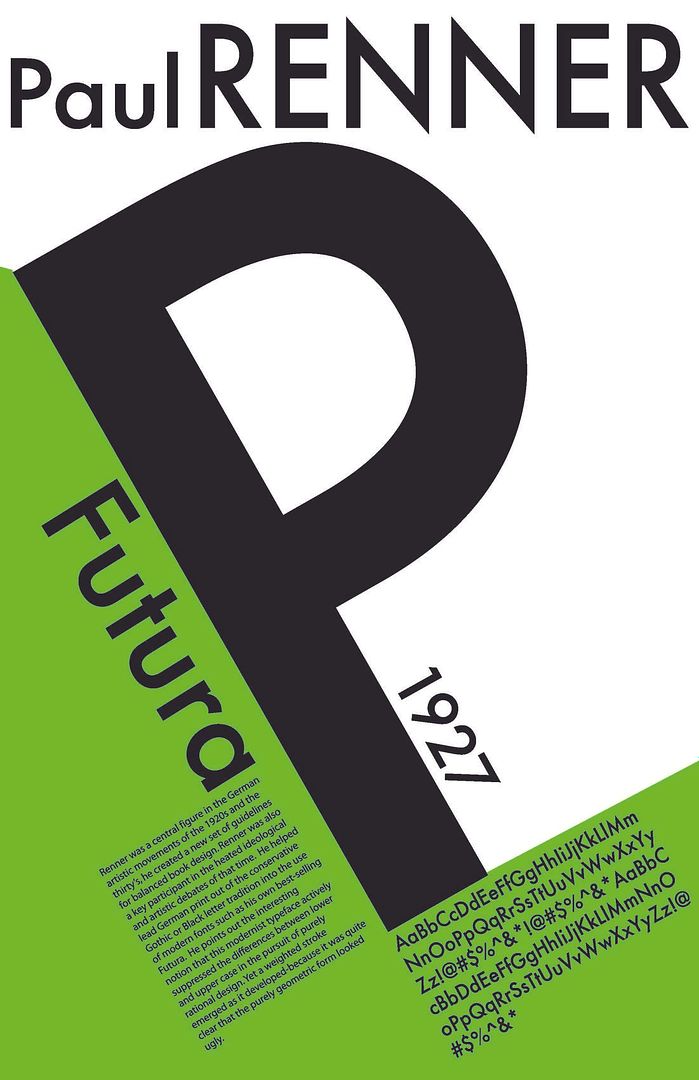
Edward Johnston examined the British Museum’s manuscripts and published a book on writing, illuminating and lettering in 1906 which became influential in Germany. There, ‘Blackletter’ typefaces were still in use. In 1916 Johnston designed a sans-serif typeface, ‘Johnston’, for the London Underground [Wikipedia 2010]. The New Book Art movement, operating prior to WW1 in Germany, used a more straightforward approach than the decorative Art Nouveau styles. William Morriss’s influence reached Frederick W. Goudy in America who created more than 100 typefaces during his working life. His successful types include ‘Copperplate Gothic’, ‘Goudy Old Style’ and ‘Trajan’ [Boardley 2009]. Art Deco style brought a plainer, more rectilinear design early in the century. English typographer, Eric Gill, designed ‘Gill Sans’ in 1927 [Stuart-Smith 2010]. Jan Tschichold published 2 radical books in the 1920s claiming book layouts should be asymmetrical and typefaces should non-decorative sans-serif designs [McLean 2010]. Sans-serif typefaces were being introduced at that time, including ‘Futura’ by Paul Renner in 1927.  Meanwhile in Germany, ‘Blackletter’ was still seen as traditional until 1941 when its use was abolished. Tschichold later relaxed his stance on serifs and produced successful typeface designs such as ‘Sabon’ (1967). Stanley Morison published “First Principles of Typography” in 1930. He was a typographic consultant to Monotype for over 40 years. In the 1930s Morison became involved in the redesign of ‘The Times’ newspaper, which also resulted in the introduction of ‘Times New Roman’ [Grove Art Online 2010].

  
LATE 20TH CENTURY AND NEW MILLENNIUM DESIGN
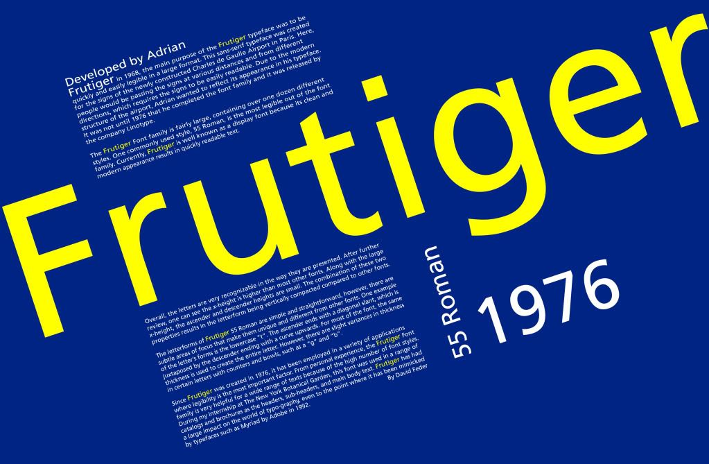
The Swiss designer, Adrian Frutiger, designed the successful typefaces ‘Univers’ in the late 1950s and ‘Frutiger’ in 1976. These sans-serif designs were intended to convey warmth and simplicity while being highly legible. Both allow for a comfortable amount of whitespace between the letters. Prominent ascenders and descenders and letters with wide apertures help enhance legibility [Linotype 2008]. ‘Frutiger’ is a very popular font available in many variants. It is used widely throughout Europe. Carol Twombly, an American typographer, had great success with her redesign of ‘Caslon’ [Sherin 2001]. ‘Adobe Caslon’ is popular as its heavy serifs and large x-height make it very readable. It was one of the first to be designed specifically for Desk Top Publishing. Desk Top Publishing (DTP) became popular in the 1980s with the rise of PCs and the WYSIWYG user interface. The layout on the screen and the final output are very similar and the content could be easily edited. Design elements, such as font choices, were accurately represented and are inserted via style sheets. DTP allows for the publication of electronic and virtual paper pages. 


READABILITY & CHOOSING THE RIGHT FONT
Visual communications must effectively capture the audience’s attention. A small default font and crowded will convey a negative message. Choose a serif or sans-serif font based on the size and amount of text. Readability is more important than legibility. Adequate whitespace between lines, words and letters enhances readability, as does a large x-height [vLetter 2010]. Choose a font that suits your message. Sharp letters suit business documents. Create a cohesive image by using the same font for all your correspondence [suite.101.com 2009].
  
WEB TYPOGRAPHY
Typography aids the design of interesting web pages. High contrast of text to background influences readability. Hierarchy involves varying type size or a mix of typefaces to point to the relative importance of areas of text [Boardly 2007]. Whitespace around text helps create a balanced appearance [Boulton 2007]. Increasing letterspacing for capital letters, acronyms, abbreviations and strings of numbers makes them easier to read. Placing invisible grid lines over a page will assist with the harmonious placement of page elements. 

THE FONT WARS
‘Helvetica’ was designed in 1957 as a neutral typeface. It is widely used in commerce and by Governments. It was named No.1 on FontShop Germany’s list of “Best Fonts of all Time”. ‘Arial’ was created in 1982 and has been included in Microsoft’s Windows software since Windows 3.1 (1992). Its letter forms and spacing were intended to make ‘Arial’ very readable at various resolutions. It is one of the most used and widely-distributed typefaces in the world. Whether or not ‘Arial’ is a ‘Helvetica’ clone is still being debated.[Boardly 2007]  Read about Helvetica v's Arial and try out the "Fontometer" on the  ilovetypograpy blog! ‘Comic Sans’ has been misused and overused. It is also subject to a campaign against its use by a couple of typographers, Dave and Holly Combs, and is frequently the subject of passive-aggressive notes. When IKEA changed its signature font from a custom version of Futura to ‘Verdana’ in 2009 complaints came from all over the world.


CONCLUSION
The invention of movable metal type and the first typeface, ‘Blackletter’, started the printing and typeface design processes. These developments were of immense importance to the development of human society by bringing reading and access to reading materials from the sole province of the rich elite class eventually through to people of all societal levels. The limitations of machinery meant that printing and type founding remained artisanal activities until the advent of the Industrial Revolution brought about the change from craft to mechanical process. The skill and creativity involved in developing typefaces shifted from individuals to corporations. Obviously, creative processes were still a part of designing new typefaces, but the relative importance of the individual designer was diminished. Trademarking and branding overwhelmed the prominent status of designers. Typeface development , however, continued and the pace escalated as did the tempo elsewhere in business. The introduction and increasing importance of the Internet has seen another major change to typeface design. Big corporations still play a huge part but the last few years have seen the rebirth of typeface development by creative people, professionals and skilled amateurs, who are working apart from big business. For the most part their tools have changed from metal and mechanical methods to graphic design and computer programs. For the near future I think the imaginative work of craftspeople will continue to flourish and expand the choices of typefaces from the restricted range available from the likes of Microsoft and Adobe. Further research aimed solely at the establishment and growth of the collaborative and inventive groups and individuals outside of the corporations would also point to the likely future of this movement. This research falls outside the scope of this current project but I believe it would be an area worthy of further study.


BIBLIOGRAPHY:
1. Garland, H & Garland, M 1997, The Oxford Companion to German Literature, Oxford University Press, State Library of Victoria, Viewed 1 September 2010, http://www.oxfordartonline.com.ezproxy.slv.vic.gov.au/subscriber/article/grove/art/T035756?q=Gutenberg&search=quick&pos=1&_start=1#firsthit
2. Bamber, G 2001, History of Printing, HistoryWorld, viewed 13 August 2010, http://www.historyworld.net/wrldhis/PlainTextHistories.asp?groupid=1951&HistoryID=ab78&gtrack=pthc
3. Garamond 2010, Wikipedia, viewed 14 September 2010, http://en.wikipedia.org/wiki/Garamond
4. Woodward, M 2010, Baskerville, the Man, the Typeface and a Strange, Sad Story 2010, suite101.com, viewed 5 September 2010, Http://www.suite101.com/content/baskerville-the-man-the-typeface-and-a-strange-sad-story-a248215#ixzz0yZRFb8Dx
5. Font Designer-Pierre Simon Fournier 2010, Linotype GmbH, viewed 18 September 2010, http://www.linotype.com/711/pierresimonfournier.html
6. Graphic design 2010, Encyclopaedia Britannica Online Library Edition, viewed 19 September 2010, http://www.library.eb.com.au.ezproxy.slv.vic.gov.au/eb/article-242764
7. Private Press 2010, Mirror of the World, State Library of Victoria, viewed 26 September 2010, http://www.mirroroftheworld.com.au/innovation/private_press/index.php
8. McLean, R. 2010, 'Typography', Grove Art Online : Oxford Art Online, viewed 1 September 2010, http://www.oxfordartonline.com.ezproxy.slv.vic.gov.au/subscriber/article/grove/art/T086759?q=Tschichold&search=quick&pos=3&_start=1#firsthit
9. Stuart-Smith, S. 2010, 'Gill Eric', Grove Art Online : Oxford Art Online, viewed 1 September 2010, http://www.oxfordartonline.com.ezproxy.slv.vic.gov.au/subscriber/article/grove/art/T032249?q=Eric+Gill&search=quick&pos=1&_start=1#firsthit
10. Edward Johnston 2010, Wikipedia, viewed 6 October 2010, http://en.wikipedia.org/wiki/Edward_Johnston
11. Boardley, J. 2009, Sex, Lies & Type, ilovetypography(ILT).com, viewed 18 September 2010, http://ilovetypography.com/2009/10/25/sex-lies-type/
12. http://www.oxfordartonline.com.ezproxy.slv.vic.gov.au/subscriber/article/grove/art/T059641?q=Morison%2C+Stanley&search=quick&pos=1&_start=1#firsthit
13. 'Typography', 2010, vLetter, Inc., viewed 29 August 2010, http://www.vletter.com/aboutfonts.htm

LIST OF IMAGES
1. Blog Image, by toinkyz
 http://i216.photobucket.com/albums/cc4/toinkyz/for%20blog/blogboard.jpg
2.Typography Image, by Tsunami65 
http://i37.photobucket.com/albums/e95/Beccatheblastergirl/Portfolio/oliverRebecca_t4.jpg
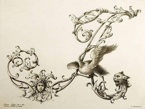
3. Flying A Image, by helena_303
http://i88.photobucket.com/albums/k197/helena_303/ornamentaltypography.jpg
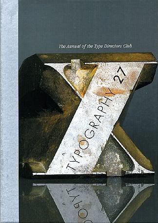
4.1 Metal X Image, by toms1802
http://i582.photobucket.com/albums/ss265/toms1802/typography-27-big.jpg
5. Garamond Image, by ifindu
http://i170.photobucket.com/albums/u243/ifindu/Portfolio/Typography_Garamond.jpg
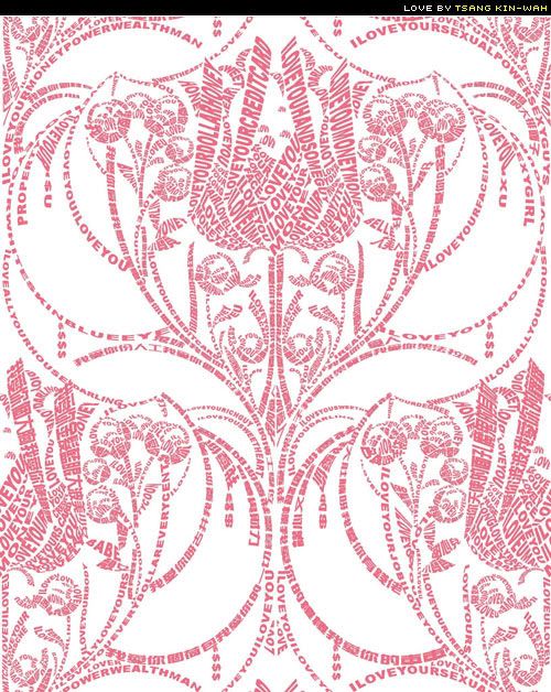
6.
Typography Rose Image, by promised2luv
http://i45.photobucket.com/albums/f79/promised2luv/typographyrose.jpg
7. The Ideal Book: William Morris and the Kelmscott Press Exhibition in Buffalo, NY
http://morrissociety.blogspot.com/2010/08/ideal-book-william-morris-and-kelmscott.html
8. Paul Renner/Futura
http://i45.photobucket.com/albums/f51/ryanjvanacker/rennercopy.jpg9. Typography Image, by bryeanahttp://i629.photobucket.com/albums/uu12/bryeana/Typography_by_fabianohikaru.jpg
10. Punctuation, by nidhisingh
http://i190.photobucket.com/albums/z58/nidhisingh/typographybookcover.jpg
11. B&W Typography Image, Adobe InDesign CS2,
http://i34.photobucket.com/albums/d117/ArtPortfolio88/typography-poster.jpg12.  Helvetica & Arial, by cgrif42
http://i370.photobucket.com/albums/oo148/cgrif42/blog/helvetica-arial.jpg
13. experimental typography, by TLY88
http://i178.photobucket.com/albums/w262/TLY88/experimental_typography_2_by_aarima.jpg
14.  Bad Font Choices, Stephendann.com
http://stephendann.com/wp-content/uploads/2010/04/badfont.jpg


Sunday, November 21, 2010

The Font Wars

It’s more than just Arial versus Helvetica
‘Helvetica’ is a sans-serif typeface developed by Max Miedinger, with Eduard Hoffmann, at the Haas type foundry in 1957.  It was originally called Neue Haas Grotesk.  The intention was to create a neutral typeface of great clarity which could be used widely for signage.  The design was revised and expanded into a full font family when it was taken up by Linotype.  It was renamed Helvetica, meaning ‘Swiss’, in 1960.  Since then a number of people have been involved in redesigning and developing Helvetica variants – it now exists as a family of 4 fonts in 2 weights and 1 width and related scripts in more than 10 languages.  Helvetica is used widely in commerce, e.g. 3M, BMW, Toyota, Panasonic, Apple iPhone and so on.  It is also used by the US Government including NASA and NYC’s MTA (Metropolitan Transportation Authority).  Helvetica was rated No. 1 on FontShop Germany’s list of “Best Fonts of All Time”.

‘Arial’ is a sans-serif typeface and computer font, packaged with Microsoft software applications and Apple OS X.  It was created by Robin Nicholas and Patricia Saunders for Monotype in 1982.  Arial is a typeface family that consists of a number of variants and related scripts in several languages.  It was originally called Sonoran San Serif until it started being included in Windows 3.1 by Microsoft in 1992.  It was one of the core fonts in all subsequent versions of Windows until Vista, when to intents and purposes it was replaced by Calibri.  Arial is a contemporary design with soft, full curves making it less ‘industrial’ than some other designs and extremely versatile.  Arial is nearly identical to Helvetica although some consider Grotesque 215 to be one Arial’s true parents.  Others think Arial is more like Univers than Helvetica.  The designs of the Arial letterforms and the spacing between the characters were intended to make the typeface more readable on screen and at various resolutions.  The inclusion of Arial with Windows and Mac OS has caused it to be one of the most used and widely distributed typefaces in the world.  

There are many people, including professional typographers and type enthusiasts who are not particularly fond of Arial due to its similarity to Helvetica and Microsoft’s role in its development and distribution.  They see the creation of Arial as a means of avoiding the payment of royalties or giving credit to Helvetica.  Monotype Imaging is the copyright holder for Arial, owning all rights, title and interest in and to the Arial font software.

If Arial is to be criticised as a Helvetica clone, then Helvetica can be said to rip-off Akzidenz Grotesk.  Both of these typefaces are derivatives of earlier Grotesque faces thereby making the entire debate fairly subjective.  That the font wars continue, and have expanded, can be seen in an article and small poll conducted in September on ShinyShiny (http://www.shinyshiny.tv/2010/09/poll_helvetica_vs_times_vs_calibri.html).  Readers were asked which font they preferred: Helvetica, Times New Roman and Calibri.  The results as at 19th November were:
Helvetica                                       73 votes    (37.82%)
Times New Roman                          41 votes    (21.24%)
Calibri                                           61 votes    (31.61%)
I write everything in Comic Sans    18 votes    (  9.33%)
                                                 _____________________
                                                   193 votes    TOTAL
                                                 _____________________

'Comic Sans' seems to be particularly out of favour at the moment, probably due to its misuse and overuse.  It was designed by Vincent Connare, a commercial photographer with a master’s degree in typography.  He has designed other well-known fonts including Trebuchet MS (the type I chose for the main text of this blog.).  David and Holly Combs’ “Ban comic sans - Putting the Sans in Comic Sans” campaign has been railing against the font since the late 90s (http://bancomicsans.com/main/) and it’s even the butt of jokes: “Comic Sans walks into a bar; bartender says, “We don’t serve your type.”. 
Listen to an interesting discussion between Vincent Connare and Dave and Holly Combs go to the BBC World Service “Font wars: should 'Comic Sans' be banned?” from 23 April, 2009: http://bancomicsans.com/main/wp-content/uploads/2010/02/bancomicsans_world_update.mp3.
And from passiveaggressivenotes.com: “Elsewhere in Seattle, “office professionalism” seems to have no bearing on freedom of speech…as long as you use the right typeface, of course.”
 
Please keep the door closed!!! Thank you!!! Please don't use Comic Sans — we are a Fortune 500 Company, not a Lemonade Stand.
The 53rd Annual Punctuation Posse Round-up, July 19th, 2010, http://www.passiveaggressivenotes.com/2010/07/19/the-53rd-annual-punctuation-posse-round-up/.
When IKEA changed its signature typeface in 2009 from a customised version of Futura to Verdana complaints were received from all over the world.  Some of the fuss was because Verdana, a propriety font from Microsoft, was intended to be used on screen and not in print.  Designers are critical as they say Verdana has no elegance of Visual rhythm and has been dumbed down and over used.  Others point out that the Futura original was a better fit with IKEA’s design philosophy whereas Verdana is used all over the web.

Post 6: Late 20th Century and the New Millennium

Adrian Frutiger
The Frutiger type family was released publicly by the Stempel type foundry, in conjunction with Linotype, in 1976.  Designed by the Swiss type designer Adrian Frutiger, the typeface’s characteristics are simplicity and legibility with a warm and casual feel.  It is a modern sans-serif typeface that echoes the rationality and clean lines of Frutiger’s late 1950’s design, Univers.  It also aims to take on the organic and proportional qualities of Gill Sans.  One of the features of both Univers and Frutiger is the comfortable white space between the letters.  This statement by Adrian Frutiger gives an insight into his design philosophy: “Typography must be as beautiful as a forest, not like the concrete jungle of the tenements ... It gives distance between the trees, the room to breathe and allow for life.”(Adrian Frutiger, Interview with Klaus-Peter Nicolay, Druckmarkt, issue 2004 9/10).  The ascenders and descenders are very prominent and the wide apertures help distinguish the letter forms and, therefore, enhance the overall legibility.  Frutiger has been expanded to include many variants, even ornamental and serif typefaces.  In 2008 Frutiger was Linotype‘s 5th best-selling typeface.  For example it is used by the British Navy, a number of universities, the Canadian Broadcasting Commission, the Finnish Defence Forces and throughout the public transport network in Oslo, Norway.  Since 2003 Swiss authorities have been using a Frutiger variant, called ASTRA-Frutiger, for traffic signs – it was based on Frutiger 57 Condensed but has up- and down-strokes that widen so that they hold the eye more effectively.

Carol Twombly
Carol Twombly was an American typographer and graphic designer who, as a pioneer in digital type design, was among the first to create whole digital typefaces that were based on historically important type that had long been used in traditional printing.  She joined Adobe Systems in 1988, releasing the display typefaces Trajan, Charlemagne and Lithos the following year.  Twombly released her Adobe Caslon, a Dutch Fell type, in 1990.  It was based on the original Caslon design by English engraver and typefounder William Caslon (1692–1766) and it is the typeface for which she is best known.  Twombly’s variation on the original was successful because its heavy serifs and large x-heights made it readable in a digital context.  The typeface maintained an even tone when set as running text and printed well with both ink jet and laser desktop printers.  One important innovation of Adobe Caslon and other early digital fonts by Twombly was that they were among the first to be designed specifically for the new printing media associated with desktop publishing.  There are a number of variants that have been produced by other designers both before and after the release of Adobe Caslon.  Carol Twombly retired from Adobe in 1999 to focus on her other design interests. 
Desk Top Publishing
Desk Top Publishing (DTP) became popular in the mid 1980s starting with the Apple Macintosh, Aldus PageMaker and PostScript.  PCs had become more popular as word processing systems such as Wang and WordPerfect revolutionized office documents.  The usage of WYSIWYG (What You See Is What You Get) user interface increased.  WYSIWYG displayed content during editing such that what was shown on the screen was very similar to the final output.  Examples of the final output included printed pages, web pages, slide presentations or computerised lighting for theatrical events.  One of the big advantages of this software was that the layout could be manipulated without having to use layout commands.  The screen display simulated the appearance and precisely represented the effect of font choices, line breaks and final pagination.  Early versions of layout software were basic by today’s standards.  The availability of cheap, or free, fonts made the conversion to do-it-yourself easier but also opened up a gap between skilled designers and amateurs.

DTP allows 2 types of pages to be prepared: electronic pages, e.g. web pages, which are not constrained by virtual paper parameters; and virtual paper pages which will be printed on paper, posters, billboards, etc.  Master pages are templates that automatically copy or link elements and graphic design styles where these are common to more than one published product, e.g. serials, newsletters, so that these do not have to be re-created each time.  Elements are laid out on the page in an orderly, aesthetically-pleasing and precise manner with text added to linked images and embedded images.  Typographic elements are applied to text with style sheets.  Modern software programs, including Microsoft FrontPage and Adobe Dreamweaver, use a layout engine similar to a DTP program.  However, some Web designers prefer to use HTML without a WYSIWYG editor for greater control.
Readability and Choosing the Right Font
Whether you are writing a report or creating marketing materials, the basics of graphic design will help you to produce visual communications that are effective in capturing the attention of your intended audience.  The art of sharing information can be optimised by incorporating graphic design elements such as combining text and symbols to better convey your message.  Even the shapes of the letters themselves can enhance the simple information being communicated by adding an emotional response to your document or design.

Using the default font on your computer, formerly Times New Roman but now Calibri, font size 12, and cramming as much information as possible onto the page will result in a very boring document that’s hard to read and from which it would be difficult to extract information.  One of the messages subtly suggested by such a document is that the author is boring and has no style or imagination. If, instead, you want to engage and excite your reader, the place to start is with the font you choose.  The font used will have an effect on how your message is received.  Having an easy to read font is an essential part of helping your reader initially scan your document, especially if we’re talking about a résumé.  

Text may be legible but not readable if the reader is prevented from reading easily and smoothly.  Readability is therefore the quality that makes the page easy to read, inviting, and pleasurable to the eye. Readability, not legibility, is, in fact, the document designer's goal!  In the past it was assumed that serif typefaces were more legible than sans-serif ones because the serifs were thought to help move the eye along the horizontal direction of reading; the serifs themselves becoming an additional means of differentiating letters from one another.  It was never conclusively shown that sans-serifs decrease legibility and serif fonts used at a small size lose their serifs anyway, so your choice should be influenced by the size and amount of text.  Most designers would recommend the choice of a sans-serif font.  Well known sans-serif fonts include Helvetica, Tahoma and Arial but there are plenty of others from which to choose.  The proportion and distribution of white space between lines, words, and characters are also major factors in determining readability.  Many sites offer free fonts these days so select one that positively influences readability and best fits the image you wish to convey.  When you look closely you will see some that appear ‘welcoming’ while others may strike you as ‘assertive’ or even ‘aggressive’.  Typefaces that create a clean or sharp image could be good choices for business documents.  There must be enough space between the lines (called leading) so that the eye can easily move in a horizontal direction, enough space between words so that they can be perceived as units, and enough space between letters so that they can be distinguished.

Generally speaking, typefaces with a larger x-height tend to be easier to read at smaller font sizes.  The x-height, or body height, is the main part of the lower case letters, exclusive of any ascenders or descenders.  It’s called the ‘x-height’ because it’s measured on the lower case ‘x’, i.e. the space from the base line of the x to the top of the x.  The x-height of a font determines its readability.  A larger x-height can make a font seem bigger than other fonts at the same font size.  The unused negative space that surrounds your text and graphic elements needs to be carefully considered so that the result is a balanced design.  White space can add an element of sophistication and elegance.  Another factor to consider as part of a design for print purposes is the choice of paper stock. 

Once you’ve selected a font and other elements that suit you, a good idea is to use them for all of your correspondence and marketing projects.  It can help you, or your business, to create a cohesive visual image.  Graphics can support the type you are using or the type can support the graphics you are using.  A strong image can draw your viewer into the document.  To deliver the message concisely and effectively, you need to make sure your type is expressive enough, your design is distinctive enough and the composition, overall, is strong enough.
Web Typography
Adobe Type Manager (ATM) was released in 1989 to improve the quality of characters and text displayed on screens or printed by Imagewriter printers.  It eliminated jagged edges which could cause small characters when magnified to become big black blobs.  ATM needed Adobe-brand Postscript type fonts called ‘Type One’.  Type One fonts were stored as mathematical formulae describing the outline of the characters plus special coding hints.  Other fonts at the time were bit-mapped, i.e. stored as a collection of dots.  Whereas outline fonts could be used in just about any size, bit-mapped fonts were restricted to ‘available’ point sizes.
Since those early days improvements have meant that attention to typography has contributed to the creation of creative and interesting web pages.  But getting a message across efficiently is more than selecting an appropriate typeface.   Some of the issues to include in web typography deliberations are contrast, size, hierarchy and white space.


Contrast is an important component as text must contrast sufficiently with the background to be readable.  A method of deciding whether or not the text and background contrast enough can be found in the ‘I Love Typography’ (ILT), ‘A Guide to Web Typography’ post (URL http://ilovetypography.com/2008/02/28/a-guide-to-web-typography/).  The article suggests taking a screen print of your document and then, using image editing software, to convert the image to grey-scale.  If the text is hard to read there is insufficient contrast.  Light text on a dark background is not so much a contrast issue but it can be difficult to read on a screen unless only applied to brief passages.


Hierarchy involves varying the type size for headings, sub-headings and the body of text so that the importance of areas of text is easily detected by readers.  Other methods for indicating hierarchy are the use of a mix of different typefaces, uppercase characters, italics, etc.  Hierarchy well carried out will result in a web page where the elements look to be in the right place.


Leaving ‘negative space’, or ‘whitespace’ around text helps create balanced articles, whether they are to be printed or displayed on the web.  The result is that web pages don’t look crowded even though they may be carrying a lot of information.  The space between elements adds to the readability of the text.  Less whitespace suggests cheap and nasty whereas greater whitespace adds a luxurious look to a page.  For an excellent article on space, see ‘Whitespace’, ‘A listapart’ by Mark Boulton (URL http://alistapart.com/articles/whitespace/ ).  


Letterspacing – Strings of capital letters and small caps should probably be allowed a little extra spacing to improve their legibility.  The readability of Acronyms and abbreviations is also improved by adding extra letterspace.  Letterspacing is essential for strings of numbers, such as serial numbers, so that they can be read more easily and rapidly.  Letterspacing lowercase letters is not recommended.


Grid – Designing a web page can be aided by the application of an invisible grid.  The use of a grid to suggest the layout of the page can be beneficial in that the individual elements are distributed across the page in an orderly and consistent fashion.
Description of the Research Process for the Sixth Post
  • I found that I needed to spend a lot of time on new research for this post.
  • I had collected quite a bit of material previously but found I needed more because I wanted to include topics that I hadn't fully thought through earlier.
  • The process of selecting information to be included in the post took a lot of time. I wanted to include more detail as my topic got closer to current times.
  • Looked for and posted more images and examples to illustrate and help explain the text.
  • Wrote the text for this post.
Reflection on the Research Process for the Sixth Post
  • I have noticed that I have been getting more and more distracted and have found concentration very difficult to sustain.
  • Looking through new sources of information I'd not found previously was very interesting but cost a lot in terms hours spent.
  • I am finding it very difficult to get the citations correct. I am hoping this this last batch is more accurate.
Discoveries for the Sixth Post
  • I was very careful this time to make sure that I included all the material I'd prepared, not like one of the earlier posts. I carefully checked the rough sketch for the items for this post.
    • I changed the number of posts per page so that the body of the text and the images down the righthand side were evenly balanced. If I'd realised earlier that this simple fix would even things up I would have done it much earlier.
    • I was surprised to find that Linda found my blog hard to read. I had shown my intended format to three people before I started posting. They all said the format was easy to read. Perhaps the difference lies in how much the different parties were asked to read.
    • By going through the procedure to check the contrast between my text and the background (recommended by 'i love typography') I discovered that more contrast between the two wouldn't have hurt.
    REFERENCE SOURCES

    1. 'Arial' 2010, Wikipedia, viewed 12 November 2010, http://en.wikipedia.org/wiki/Arial
    2. Boardly, J. 2007, '15 Excellent examples of Web Typography, Part 2 Taking a List Apart', ilovetypography.com, 27 September, viewed 18 November 2010, http://ilovetypography.com/2007/09/27/15-excellent-examples-of-web-typography-under-the-bonnet/
    3. Boardly, J. 2008, 'A Guide to Web Typography', ilovetypography.com, 28 February, viewed 29 August 2010, http://ilovetypography.com/2008/02/28/a-guide-to-web-typography/
    4. Boardly, J. 2007, 'Arial versus Helvetica, Seconds Out, Round 1', ilovetypography.com, 6 October, viewed 3 October, 2010, http://ilovetypography.com/2007/10/06/arial-versus-helvetica/
    5. Boardly, J. 2009, 'Web fonts - where are we?, Untangling the Tangle', ilovetypography.com, 20 July, viewed 18 September 2010, http://ilovetypography.com/2009/07/20/web-fonts-—-where-are-we/
    6. Boulton, M. 2007, 'Whitespace', A Listapart, 9 January, viewed 18 November 2010, http://www.alistapart.com/articles/whitespace/
    7. 'Carol Twombly' 2010, Wikipedia, viewed 16 November 2010, http://en.wikipedia.org/wiki/Carol_Twombly
    8. 'Caslon' 2010, Wikipedia, viewed 16 November 2010, http://en.wikipedia.org/wiki/Adobe_Caslon#Adobe_Caslon_.281990.29
    9. 'Desktop publishing' 2010, Wikipedia, viewed 16 November 2010, http://en.wikipedia.org/wiki/Desk-Top_Publishing
    10 'Helvetica' 2010, Wikipedia, viewed 12 November 2010, http://en.wikipedia.org/wiki/Helvetica
    11.Lewis, P.H. 1989, 'Personal Computers; Answering Questions About Fonts, New York Times' Gale Science In Context, viewed 19 August 2010, http://ic.galegroup.com:80/ic/scic/NewsDetailsPage/MLA7CitationWindow?displayGroupName=News&prodId=&action=2&catId=&documentId=GALE%7CA175806766&userGroupName=yarra_plenty&jsid=3c8c9187e5e4d201cbb3998c8a5c853c
    Gale Document Number: GALE|A175806766
    12.Page, S. 2008, 'Design Inspiration : typography posters',
    simoncpage.co.uk, viewed 19 September 2010, http://simoncpage.co.uk/blog/2008/08/28/design-inspiration-typography-posters/
    13.Pratt, S. 2009, 'A Short Lesson in Graphic Design', suite101.com, viewed 5 September 2010, A Short Lesson in Graphic Design: Picking the Right Typeface for Your Acting Resume http://www.suite101.com/content/a-short-lesson-in-graphic-design-a176973#ixzz10c7E2zIQ
    14.Pullen, I. 2009, 'What are the basics of Graphic Design: Quick Tips and Advice on the Essentials of Design', suite101.com, viewed 5 September 2010, http://www.suite101.com/content/what-are-the-basics-of-graphic-design-a90042#ixzz10c90kPJD
    15.Pullen, I. 2009, 'Discover the Anatomy of a Font', suite101.com, viewed 5 September 2010, Discover the Anatomy of a Font: How to Distinguish the Different Parts of a Typeface http://www.suite101.com/content/discover-the-anatomy-of-a-font-a102841#ixzz10c5d60zx
    16.Ramsey, S. 2010, '20 Free Fonts Ideal For Logos And Headings', bluefaqs inspiration for designers, viewed 18 September 2010, http://bluefaqs.com/2010/07/20-free-fonts-ideal-for-logos-and-headings/
    17.Rutter, R. 2005, 'The elements of Typographic Style Applied to the Web',
    webtypography.net, viewed 5 November 2010, http://webtypography.net/
    18.Sherin, A. 2001, 'Carol Twombly', Grove Art Online, Oxford Art Online, viewed 1 September 2010, http://www.oxfordartonline.com/subscriber/article/grove/art/T2022076
    19.'Typography', 2010, vLetter, inc., viewed 29 August 2010, http://www.vletter.com/aboutfonts.htm
    20.'WYSIWYG' 2010, Wikipedia, viewed 16 November 2010, http://en.wikipedia.org/wiki/WYSIWYG